LIGHT AND ARCHITECTURE

As a starting point for this project I began research into the significance of light in architecture. I was interested in finding out how architects worked around natural and artificial light. 

Designing around natural light
 
Building Orientation - Architects must have knowledge of sun paths for sites and must ensure that the buildings work with the passage of the sun crossing the sky to let in light, passive solar gain as well as reducing glare and overheating to the building interior. They must consider the sun in the sky is dynamic, changes according to the time of day, time of year and the sites latitude.


Well-orientated buildings maximise daylighting through building façades reducing the need for artificial lighting. Buildings that maximise sunlight are ideal for the incorporation of passive solar collection techniques that can reduce carbon use to enhance user comfort. It is important to know how the sun interacts with a building in high summer and depths of winter.

In the past the passage of the sun across the sky was plotted with pre printed sun path diagrams for specific latitudes. Thankfully CAD packages can do this for you. specifically Google Sketch Up is effective in setting up a model for any global location and then able to stimulate a sun path across a building. 

 Design Procedure:

  • Step 1: There is no single design procedure to design for orientation. However, you need to model your proposal in a package such as Google Sketch Up.
  • Step 2: Ensure the building is properly placed on its site in relation to north and the location either geographically or in terms of latitude or longitude is entered.
  • Step 3: Use a sun or shadow tool to model the building at seasonal extremities.
  • Step 4: Be conservative in the use of glazing to heavily exposed sides.
  • Step 5: Model the use of solar shading devices.
  • Step 6: You can quantify solar gain coming through glazing over a year using in a domestic context, really simple SAP tools. Other packages such as Autodesk Ecotect and IES VE-ware can model solar gain and possible overheating of a building model.
  • Step 7: Remember orientation is about protection and mitigation of sunlight in buildings as well as accommodating solar gain.

Elements of artificial light 

General or ambient lighting - Provides a room with overall lighting, also known as ambient lighting general lighting radiates a comfortable level of brightness enabling one to see and walk around safely.
Task lighting or lighting at a work area - helps you perform everyday specific tasks such as reading, cooking, sewing, hobbies, games. 
Highlighting or emphasizing a space -  adds drama to a room by creating a visual interest, as a part of a decorating scheme is used to spotlight rooms, paintings, plants, sculptures, or used to highlight a texture of a wall, drapery or outside landscaping.


Direct and indirect light - is emitted from a light source and travels in a straight path to the illuminated point (either on a surface or in a volume).
Forming function zones - Light can be used to illuminate individual function zones in an area e.g traffic zones, waiting areas and exhibition areas. Differentiation in lighting divide up a area and improve orientation.  
Defining a spatial border - floor illumination emphasizes objects and pedestrian borders.   
Degrees of brightness and contrast - Evokes emotions in the same way as as background music. It effects the performance of a task, peoples behaviour and the containment and pleasure we experience. 
Emotional impact of light - both psychological and physiological well being, and day to day moods.


Light thread by eastern design office ( Beijing, china )

This image below is an example of how both artificial and natural light are used to illuminate and enhance the design of a building. The "light thread" is cut out 3 dimensionally from the rectangular concrete, allowing sunlight inside in the day.  


CREATING LIGHT EFFECTS

After gaining a better understanding on how natural and artificial light is used in architectural spaces, I turned my focus on how lighting evokes and effects emotions in people from this research I found -  
 
—People tend follow the brightest path in a space 
—Brightness can focus and attract attention
—Facing wall luminance is a preference
—Lighting can affect body position 
 
I will need to consider all this when designing the light. It will be the main focal point in a room and will illuminate the space by light effects. I thought about ways to create reflections and shadows. To gain inspiration I looked at more innovative ways light is used to create effects.
 3D Projection Mapping - is the method of  projecting an image on a 2 dimensional surface or plane. When looking at the scene the objects  in the distance appear smaller then the objects  close by. I found this projection show very interesting to watch left me thinking of ways to create similar illusions without a  projector ?


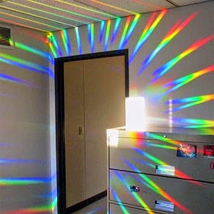
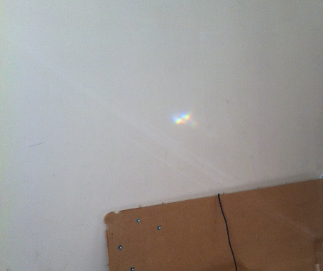
Newtons Prism Experiment - proved that natural light was a combination of colours which we now call the colour spectrum. The image on the right shows how when light is refracted at a certain angle onto a prism a spectrum of colours are formed. To prove his theory he placed another prism upside down in front of the first prism, and the band of colours combined again into white sunlight.


I will produce a range of experiments based on this research to refract light and create effects using both natural and artificial light. The effects on the image are formed when natural light hits the prism shape although this particular image may have been enhanced using Photoshop.


Another way I could create effects is by designing a light shade which casts shadows.
Although this technique produces effective outcomes my design will have to be innovative and original, as there are many similar light products in the market. The forest chandelier was designed by a pair of Danish artists who where inspired by nature and the  drawings of the German naturalist Ernest Haeckal. It creates a virtual forest and as the light intensifies the room changes slowly  becoming more fascinating. The chandelier pieces are made on a 3D printer, the hardened plastic powder withstands the heat from the LED lamp. 

CONTEMPORARY LIGHTING AND INSTALLATIONS

Soo Sunny Park - The Unwoven Light


The unwoven light is a beautiful installation which manipulates light using plexiglas  pieces attached to a wire frame. In the documentary below the artist Soo Sunny park talks about the design process of her work and how her ideas develop. I find the concept of creating a light  which "appears" in thin air fascinating and has to be one of my favourites!  

Jung Lee – “Aporia”

 I couldn't help but feel touched by the neon art installations. The powerful language displayed in contrast with the empty and isolated environment brings a real sense of sadness or emptiness. The South Korean artist and photographer Lee Jung created Aporia, which is the Greek word for a passage, dead end, or the inability to give a precise answer to a problem. Her art installations are inspired by words from the book "a lover's discourse" by Roland Barths." If you are in love with someone, there are such deep feelings you want to express, but words don't do them justice so you end up repeating title phrases from films or a song" says Jung Lee. She interprets love as an addiction, a state of entrapment a place with out exit. 


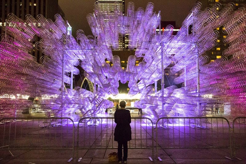
Ai Weiwei – “Forever Bicycles”


This 3 dimensional installation compromises of 3,144 identical stainless steel bicycles. It was created to generate awareness of transportation’s impact on the environment. The artist took an everyday object-the bicycle-and used it in an abstract and symbolic way. It is a spectacular labyrinthine structure that plays with different visual effects. Viewed from different angles, it can take on an abstract quality and transform itself into a kind of blurry urban mirage. People can navigate through it and experience it as a space that appears to be in motion.


Yayoi Kusama – “Infinity Mirror Room”


The infinity mirror room consists of hundreds of flashing led lights hanging from a ceiling. The mirror tiles that cover the entire room add reflections of led lighting giving the viewer an experience of being in an astonishing endless space. Its amazing how the whole room is transformed by the use of mirrors, which really opens your mind to how materials can be used in a way to create something extraordinary. This has inspired a range of experiments using mirror to reflect light and produce different effects. An alternative to glass mirror could
mirrored card or acrylic which are more accessible and suitable 
for the final design.


Tokujin Yoshioka – “Crystallize”


The crystallize installation stands At 12 metres high and is composed of 500 crystal prisms that convert natural rays of light into rainbow colours. It is known as the rainbow church and is exhibited at the museum of contemporary art in Tokyo. The artists inspiration comes mainly from the formation of natural structures that are composed through the crystallization process. This is relevant to my project as it incorporates Newton's prism theory which is something I have looked into previously to develop ideas. I thought of designing a chandelier with a number of prisms which will create a spectrum of colour effects using artificial light.


Marcus Tremonto - Contemporary Lighting  


 Carbon Light 541 - 


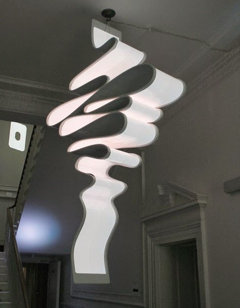
Marcus Tremonto is a designer focuses on the development of materials that reflect the modern age and represent the future in shape. I particularly like how playful yet simple the ribbon fixture is, although a disadvantage would be the carbon fibre used as this is an expensive material. 


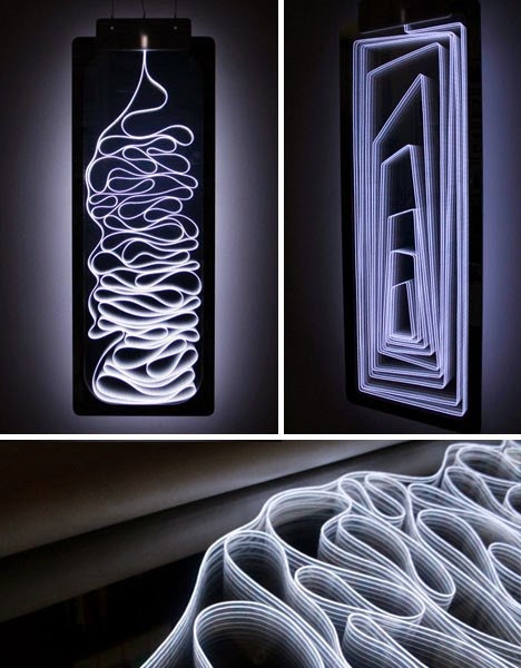
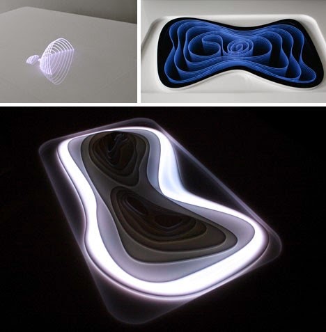
 "Light works" is a series of 16 sculptural light forms created using an electroluminescent material (The glowing lines)  enclosed in reflective Perspex. An illusion is formed using the Perspex which creates an effect of the whole object when in fact only half actually exists


PRIMARY RESEARCH ( Lighting and Experiments )


 The aim of the primary research was to find out - 

- what defines contemporary lighting and how could I design a product that was different then any already in the market?
- What is more preferred contemporary or traditional lighting?
- Why have artists used particular materials and techniques for there work and how could this be relevant to my final design?

To gather this research I visited a number a retail stores including Stockton's, Rapids and Utility.                
                                                        
Stockton's Designer Lighting - Specialises in more unique and luxury lighting, suitable for a dining area or a space in which the light would be the main focal point. I looked at two chandeliers at Stockton's which where quite expensive, yet both beautiful designs. I particularly liked the form and structure of the chandelier on the left. 


Rapids - .Whilst observing the lighting at rapids I made notes of materials I had not considered using for my design such as adhesive mirror ( light bulb ) or types of transparent fabrics. I also noticed the lighting section at rapids stocked more contemporary products which shows they are more likely to sell then traditional lighting.


 Utility - products come from Italian and Danish manufacturers including Artemide, Flos, Foscarini, Lightyears, Tom Dixon, Kartell, Mooi, Bestlite and Luce plan.

The Ecos Lamp - lampshade is covered in authentic white feathers allowing the light to shine through. It fits onto an existing ceiling pendent so there's no electrical work involved. It can also be mounted on a table or floor lamp base too with an adapter. 


This pine shaped lamp is also similar to the Ecos lamp as it can be attached as a pendent or mounted on a table of floor lamp. It is made from a polypropylene material which is a suitable type of plastic for lighting, It is presented in a small carrier box and has been designed to be assembled in 20 minutes. The ceiling rose or pendent for the lamp can also be bought separately.  


High street stores - use exclusive designs and lighting to enhance spaces or make them appear more spacious. It was interesting to see if the research I did previously on light in architecture was connected to the interior spaces at the stores.  


Bluecoat Arts Centre Liverpool - Installations 
Beatrice Haines - Heavenly Bodies IT,2010 Backlit scanning electron micrograph 66x85cm 

This was an interesting installation which uses a scanning electron microscope to produce images of a desired sample Electrons interact with atoms in the sample, producing various signals that can be detected and that contain information about the surface topography and composition.


Marlene Oliver - Family Portrait ( Mum and Dad ) 
2003, Screen prints on clear acrylic, Bronze rods, 
 192x70x50cm each 

The artist demonstrates a family portrait in a 3Dimensional form. The concept seems simple and creates and amazing outcome. Looking at this gave me an idea to design a light fixture using phosphorescence material (glow in the dark) to replace the bronze rods and possibly use different shaped acrylic sheets.


My experiment's where created using a prism and mirrors to reflect natural light rays through a window. The mirror reflected a bright clear light which was effective. I also found this worked well with artificial light and will potentially use a mirrored material for my final design. The prism experiments where based on Newton's prism theory which uses a clear block to convert white light into a multi-colour light. These also worked really well but needed a lot of light to create the effects. The artificial light did not work so I decided not to develop this particular experiment.
 

DEVELOPING DESIGNS

The primary research I conducted helped me decide -

-  I will design a light shade that was multifunctional, when it wasn't being used as a lightshade it unfolds into a decorative piece for the home. I felt this made my design innovative and different to lighting products I had looked at.

- The materials I could potentially use where mirrored polypropylene, Self adhesive mirrored vinyl, mirrored card or acrylic. This was because these materials where pliable, accessible, affordable and would withstand the heat from the light bulb. The mirror would reflect and manipulate the light casting interesting reflections in a space.

- I would need to consider the fixtures, how would the lightshade be attached to a frame then be detached when user prefers to use it as a decorative piece. I thought of using small hooks or Velcro depending on the weight of the material.

- The design would be made from one sheet of material for a contemporary appeal, and would be around 40cms high 30cms wide (large enough for it to be the main focal point in a room)


Taking into account all the factors from the research I began to sketch my ideas and developed paper mock ups, which helped me visualise the designs and whether I needed to make any changes or improvements.


RHINOCAD AND PROTOTYPES

At this point I had a clear idea in mind for the final design, which was a geometric lightshade that could  be altered and used as a decorative piece. The only issue I had with this was how would the design keep the desired form as a light shade or decorative piece? Would I use some sort of elastic or wire? This then led me to thinking of using a fabric or vinyl material for the light and attaching mirrored shapes separately. This way I could incorporate wire into the material giving the user the flexibility to alter the design into a variety of forms.
 
These lines where drawn on Rhinocad for the individual diamond shaped pieces to be cut out on the laser machine. 


Prototypes for light design - Here I attached the mirrored acrylic pieces onto a vinyl material. It was important the pieces where placed at a certain angle as this would allow the lightshade to turn in the circular way. The flexible wire would then be glued onto the opposite side and covered with a vinyl material, allowing the user to alter the form.


  When I completed this prototype I decided to
change the shape of the design into something more interesting such as a diamond shaped lightshade.

DEVELOPING FINAL MODELS

 This shows realisation of the final models and why I reverted the design to an earlier stage in the design process.

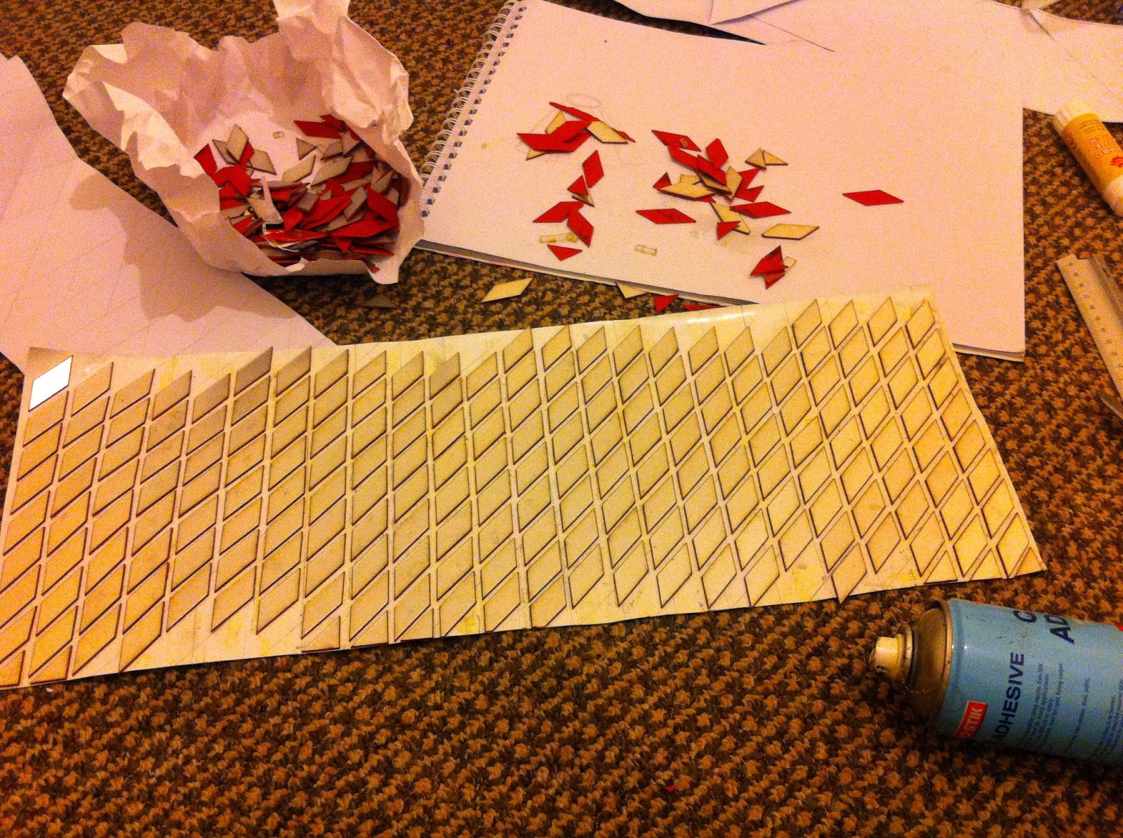
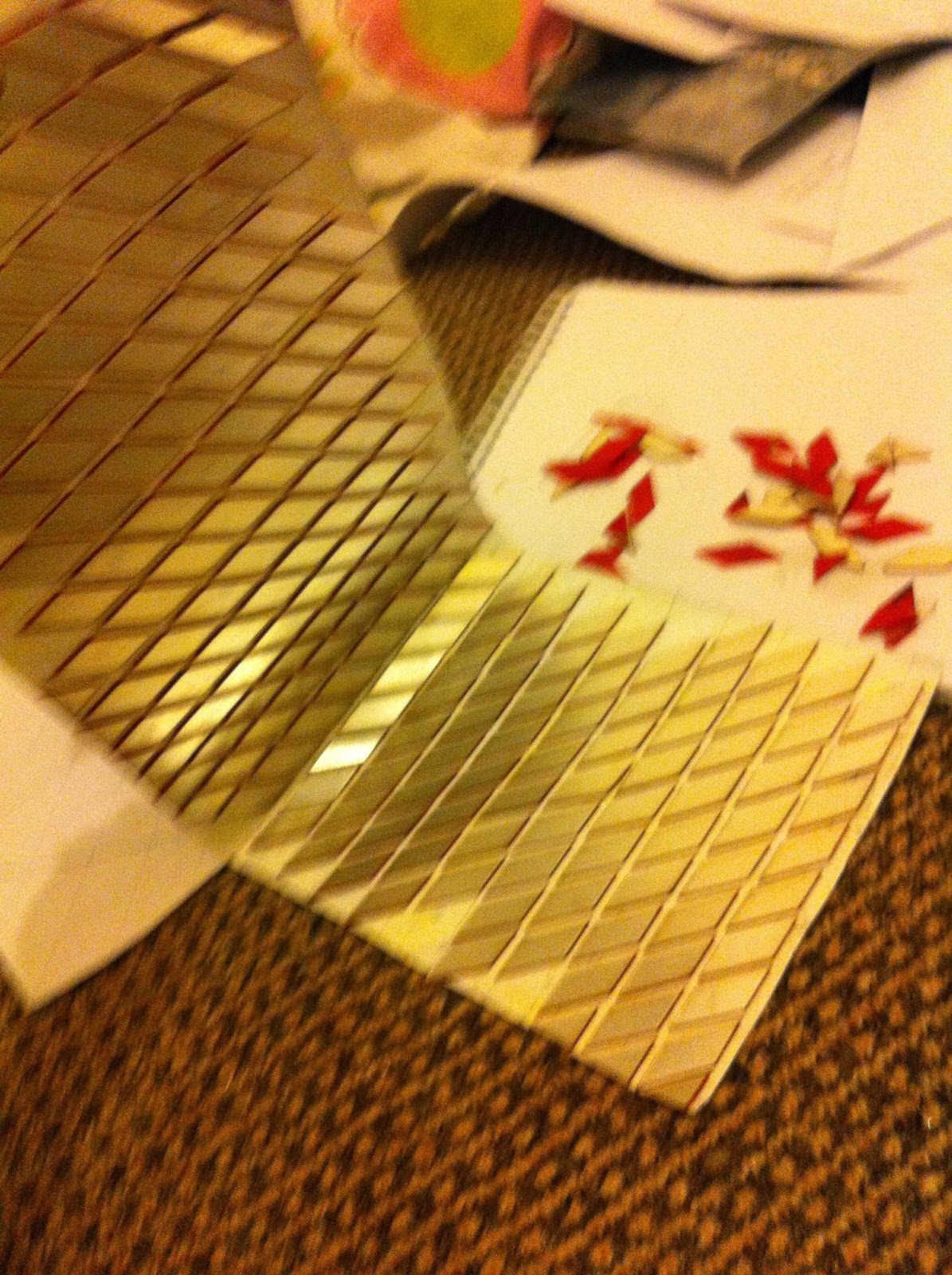
Design One - Is a diamond shaped decorative piece which folds perfectly into a cylinder light shade. It takes its inspiration from Soo Sunny parks Unwoven light (the concept of creating a light that appears in air) by attaching diamond shaped mirrored pieces on either side of transparent vinyl material. Flexible wire attached in between the (Two) vinyl sheets allows the user to alter the form of the design.


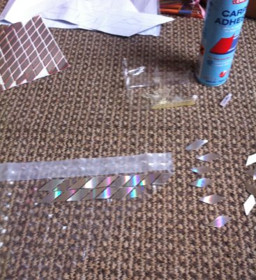
Diamond shaped pieces where cut out on the laser machine using sheets of hologram card. I originally wanted to use a mirrored Perspex material but was not able to get it in time for project deadline as orders could only be placed online.

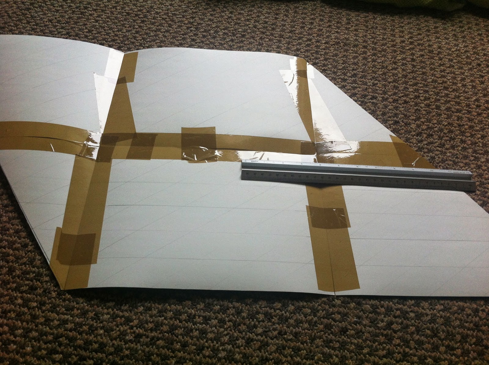
Tape was placed around the first hologram card so that I was able to assess where the following sheets should be positioned. The laser was stopped a number of times during the cutting process, as the fumes inside moved the pieces causing them to overlap  and ruin other shapes.


Here I began attaching the laser cut pieces onto the vinyl material, using a spray adhesive which I found worked really well. Although I thought the design was a good concept I was not pleased with the outcome. It began to resemble a piece of fabric rather then an interesting decorative piece. It was overcomplicating a simple design and was not worth  developing any further.


I now decided to get a second opinion by conducting a peer review which compared both designs and whether I could make any improvements or changes. From this I found

 - The second design was more effective,
 - I should use mirrored Perspex for design (similar properties to card),
 -Light shade could be attached to frame using small hooks.

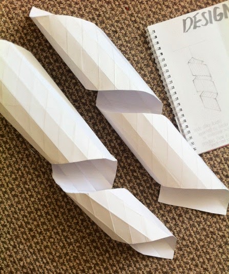
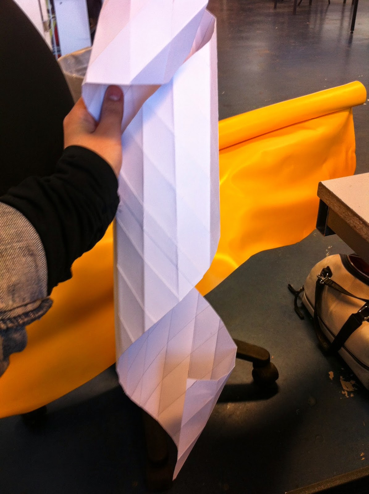
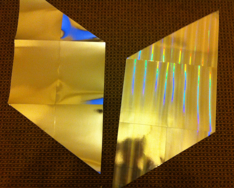
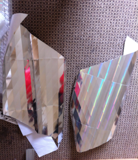
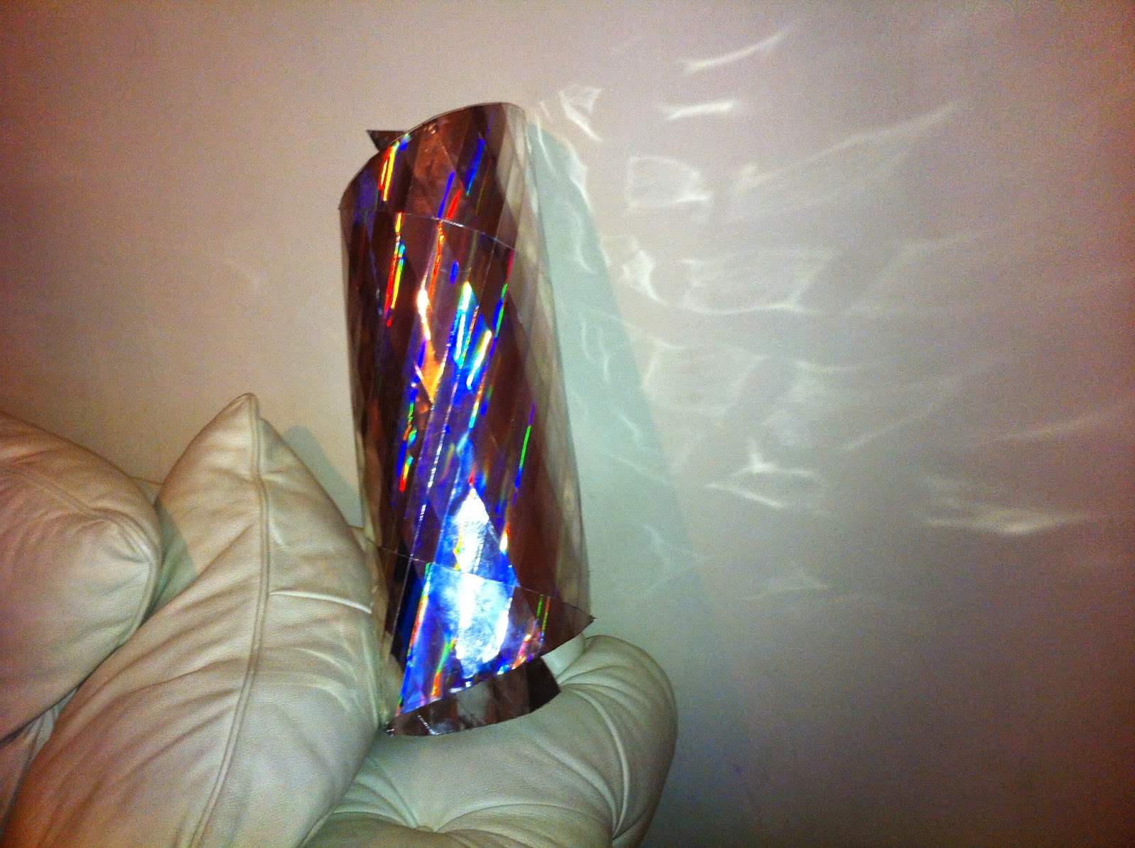
Design two - The geometric forms and shape of design allows it to be folded easily into a cylinder light shade. It is attached to frame using small hooks allowing the user the flexibility to use as a decorative piece. The main inspiration came from digital sculpture project (manipulating 2D acrylic material into a 3D cat design).


The glue used gives the light shade its structure and holds the form. The two geometric sheets sides are then attached using a spray adhesive.  
                                                                               

 The outcome was effective as a decorative piece. It produced interesting 
 light effects and folded into a cylinder light shade. Small hooks will attach the light shade onto the frame for the fixtures.    


The glue gun used to outline foldgives the hhade a structure and h